GAP
HDR
GAP
DIV
Decreasing drop-off at the point of entry
Subtle details in the Dia onboarding were mismatched to user expectations. Made changes to improve aesthetics, match expectations, and add a little more delight to the final experience. The minor details is what keeps people captivated.
GAP
DIV
Color hierarchy
Before
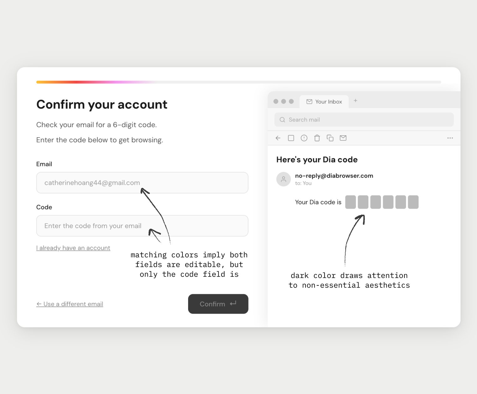
Unclear color hierarchy creates false affordancesImage
After
Clear hierarchy directs focus to the code fieldVideo
GAP
DIV
Reflecting expectations
Before
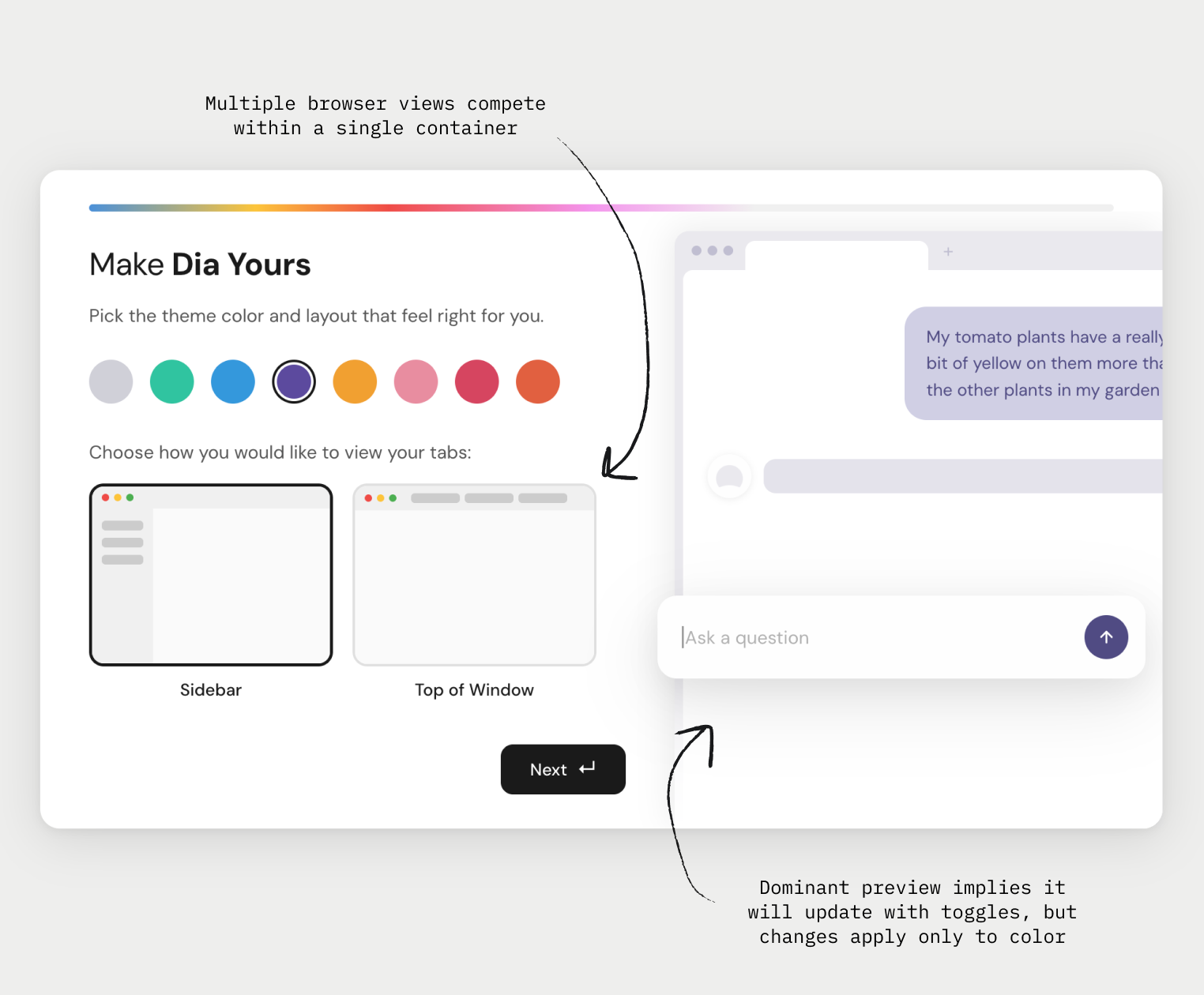
Multiple views imply functionality that isn't supportedImage
After
Reduced visual noise directs focus to meaningful choicesVideo
GAP
DIV
Accurate demos
Before
Demo ignores ⌘T shortcutVideo
After
Browser motion consistent with expectationsVideo
GAP